Illustrations for website
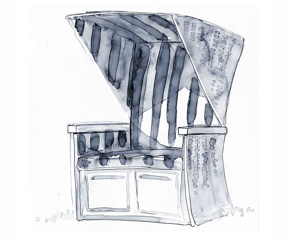
One of them (maybe my first client ever?) liked the style for the images they needed for the website they were about to launch. Facility Consultants commissioned me to create a maritime imagery that would symbolise the different fields in their business and to add some hand-lettering and adapt it all to the formats they needed for their template.
I was glad to see how non-purpose summer sketches developed into a real project. And I felt honoured and delighted that a business that traditionally does not use illustration -much less in watercolour style- had the initiative to implement it in their main web presence, creating that way an outstanding, refreshing and memorable image. Bravo, dear Facility Consultants, and thanks for trusting my work!
This is part of the result but, of course, you can see it better if you visit my client's website:


