Testing the Illustration paper of Hahnemühle
There are at least ten square Hahnemühle D&S sketchbooks in my shelves, full of drawings. And a couple more waiting for their turn in the drawer. Only: since the beginning of this year I have started using brush pens that don't run very easily on the paper of those sketchbooks, they need a softer surface in order for the tip not to fray out. I like the Bristol quality and I use also the SketchPad by Hahnemühle (as I did at the last live drawing session). But those come in a DIN A4 format and I wanted to have something similar in a more travel friendly format.
So, I asked Hahnemühle whether they have something like that in their assortment. We had met last year at the CreativeWorld and we keep a nice contact ever since. They recommended the DiaryFlex and the Nostalgie sketchbooks, both in a size that fits easily in a handbag. They are not as white as I would wish them to be but they have definitely a very smooth, really nice, surface. As they gave me this recommendation they also asked if I would be interested in testing their Illustration paper: it fulfils my requirements regarding colour and smoothness, only they come in DIN A4 and DIN A3 sizes. But anyway: Interested in testing a paper with the name "Illustration" all over its cover? Of course!
This 120 gr/m2 paper is sold in stacks of 30 loose sheets, not bound in a block. I find it practical: the size already means I am going to use it in the studio, on my desk, and here I always work on single sheets (easier to draw on and much easier to scan).
These are the techniques I tried the paper with:
1. Fine liner + water soluble brush pens
2. Ink dip pen + watercolour
3. Water soluble pencils
4. Fine liner + alcohol based markers (despite Hahnemühle's warning)
1. Fineliner + water soluble brush pens
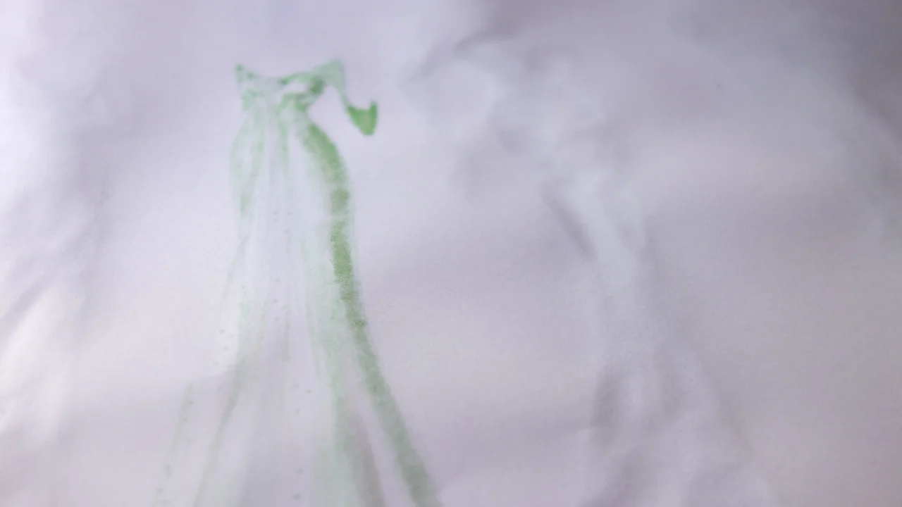
It works perfect. The paper is smooth and the brush-point of the markers glides perfectly without being damaged. The paper holds the amount of water needed to solve the marker's ink without problems (I used the Tombow ABt and the edding 1340 brushpen with a Kuretake water-containing brush). You can see it on this video:
2. Ink dip pen + watercolour
In this case I also find the paper very appropriate. Since I applied the watercolour with a conventional brush, I had less control on the amount of water and the spots that received more liquid bled a bit but more creating an interesting effect than a real problem. It is something you should take into account though: this is not a watercolour paper. But it works with watercolours for quick illustration works that do not involve huge amounts of water. I also took a video of this process:
3. Water soluble pencils
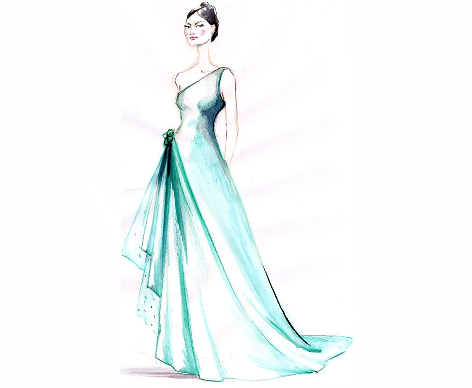
This is a media I use a lot: either for complete sketches (like in the picture below) or to give a drawing made with black ink a little colour touch. That is why I wanted to try this paper with my InkTense pencils. This is a technique that involves water in small amounts and, as said before, the "Illustrator" paper can take it.
4. Fineliner + alcohol based markers (despite Hahnemühle's warning)
My contact at Hahnemühle had told me that the paper is not suitable for alcohol based markers. I wanted to try it though, because I thought it could be interesting for many of you, who like to use that kind of media (I used Copic markers, by the way). The result is not bad: the colour does go through the paper but not in the wild way I know from other papers, where whatever that is underneath gets stained. Here you can see the colour shape, especially the spots which got more colour but other than not being able to use the backside of the paper, it is not a problem. I hope you can appreciate what I mean on this photo of the backside:
So my verdict: a perfect paper for a wide range of illustration techniques. If your choice includes water I recommend not to abuse it and not to cover the whole surface with it. I love the whiteness and smoothness of this paper. Now I hope one day is available in a smaller format that I can get with me when travelling.


